PhotoGalleryASPX 1.2


Abstract:
-
PhotoGalleryASPX is a Web User Control that enables you to setup a picture gallery in any ASP.NET enabled website.
-
There is no need for a database, the data store consist of a series of XML files associated with the each picture,
thus it makes it very easy to set it up in a shared web hosting environment, back it up or move it from one server to another.
Just copy the pictures over and you're done.
-
PhotoGalleryASPX supports thumbnail view and full size view.
-
PhotoGalleryASPX has a minimal graphical design footprint, thus it integrates well with just about any website as you can see
in this example below.


-
PhotoGalleryASPX also works well with websites that explicitly specify a document and also with websites that redirect
to a folder.
-
It also supports paging in both thumbnail view and full size view.
-
It support different categories of pictures that the user can select to view and for each category the
page size can be customized.
-
It's possible to add a description for each picture that will be displayed along the picture itself.
-
Paging can be also customized as well, in both thumbnail view and full size view the page size can be customized.
-
Users can also upload a picture, the control will automatically resize it and save it to the webserver.
-
Uploaded pictures can go to a staging area where they have to be approved before being published, or they
can be automatically approved and go live without any admin intervention.
-
Tested with several thousand pictures in each folder and the server processing time is usually under a tenth of a second.
Pictures download speed will vary depending upon your provider's bandwidth and your ISP.
Requirements:
-
Microsoft Visual Web Developer 2008 (free), or Microsoft Visual Studio 2008 (paid)
(note that this project may work also in earlier version of Visual Web Developer or Visual Studio, I haven't tested those scenario though)
Usage:
-
The control needs to be instantiated in any ASP.NET page.
In the DirectoryBase directory create your first category. The category is a directory whose name MUST follow this format:
-
number name
number is a numeric integer that will be used to sort the various directories
name is the name of the directory, spaces and non-Latin characters are allowed.
Note the single space between number and name
Once you have uploaded some pictures, locate the directory you have specified in DirectoryBase
Inside you will find a directory called "_User_Uploads_To_Be_Approved".
Move all the files from that directory to the category folder you've just created.
If necessary, edit the various .XML files and you're done!
See Syntax: below for the properties available in order to customize look, feel and
functionality.
Real World Implementation:
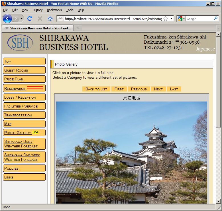
-
This is an hotel in Japan that has implemented PhotoGalleryASPX
to show their customers their facilities and the surrounding areas.
-
If you do implement this control and would like your site to be included here, email me at giuseppe AT davoli DOT net
Syntax:
-
<tagprefix:tagname runat="server" parameters />
tagprefix and tagname are whatever was declared in the web.config file when the control was first installed
parameters are described as follows:
DirectoryBase: (required)
Is the name of the directory, relative to the location of the .aspx file that host the PhotoGalleryASPX control.
The directory MUST end with a "\" (without the quotes)
DirectoryUpload: (optional)
Specifies the directory off the DirectoryBase location where the uploaded files will be saved into.
The directory MUST end with a \ and MUST NOT start with \
If DirectoryBase has the same value as one of the category folders (see Usage), then the pictures uploaded
will be saved in that folder and will be immediately available for viewing.
ButtonBackToListText: (optional)
Specify the text for the button that goes back to item view mode.
ButtonFirstPageText: (optional)
Specify the text for the button that goes back to the first page.
ButtonLastPageText: (optional)
Specify the text for the button that goes back to the last page.
ButtonNextPageText: (optional)
Specify the text for the button that goes back to the next page.
ButtonPreviousPageText: (optional)
Specify the text for the button that goes back to the previous page.
ButtonsPageNavigationContainerStyle: (optional)
Specify the style for the container to be used for the page navigation buttons.
ButtonsPageNavigationContainerCssClass: (optional)
Specify the class for the container to be used for the page navigation buttons.
ButtonsPageNavigationStyle: (optional)
Specify the style to be used for the page navigation buttons.
If not specified, a default style will be used.
ButtonsPageNavigationCssClass (optional)
Specify the class to be used for the page navigation buttons.
ButtonSubmitYourPicturesStyle: (optional)
Specify the style for the button that let the users upload their pictures.
ButtonSubmitYourPicturesText: (optional)
Specify the text for button that let users upload their pictures.
ButtonSubmitYourPicturesVisible: (optional)
Specify if the button that let users upload their pictures is visible.
ErrorCustomMessage: (optional)
When an error happen, displays a custom error message instead of this page.
MenuItemBackColorSelected: (optional)
Specify the background color for the selected items in the categories menu.
MenuItemBackColorUnselected: (optional)
Specify the background color for the unselected items in the categories menu.
MenuItemTextSelected: (optional)
Specify the text color for the unselected items in the categories menu.
MenuItemTextUnselected: (optional)
Specify the text color for the unselected items in the categories menu.
MenuTitleText: (optional)
Specify the text for the categories menu title.
PageSizeDetails: (optional)
Indicates how many items will be displayed per page in detail view mode.
If this is not specified it is defaulted to 1
PageSizeItems: (optional)
Indicates how many items will be displayed per page in item view mode.
If this is not specified it is defaulted to 10
PictureBackgroundColor: (optional)
Specify the background color that will be used around the picture.
PictureBorderColor: (optional)
Specify the border color that will be used around the picture.
PictureBorderWidth: (optional)
Specify the border width that will be used around the picture.
PictureLargeHeight: (optional)
This functionality is not implemented yet
PictureLargeWidth: (optional)
This functionality is not implemented yet
PictureMediumHeight: (optional)
Indicates the height the uploaded picture will be resized to in detail view mode.
If it's not specified it is defaultded to 375px
PictureMediumWidth: (optional)
Indicates the width the uploaded picture will be resized to in detail view mode.
If it's not specified it is defaultded to 500px
PictureSmallHeight: (optional)
Indicates the height the uploaded picture will be resized to in item view mode.
If it's not specified it is defaultded to 98px
PictureSmallWidth: (optional)
Indicates the width the uploaded picture will be resized to in item view mode.
If it's not specified it is defaultded to 130px
PictureTextColor: (optional)
Specify the text color that will be used for the picture description.
PictureTextFontSize: (optional)
Specify the text font size that will be used for the picture description.
RedirectDefaultPage: (optional)
If true, every link will redirect to the folder instead of the page hosting the control.
If false, every link will redirect to the specific page hosting the control.
SubmitButtonText: (optional)
Specify a custom text for the various element in the image upload area.
SubmitCheckBoxPublishTFText: (optional)
Specify a custom text for the checkbox where the users authorize the publication of their uploaded images.
SubmitCompleteURL: (optional)
The URL of the page where the user will be redirected after sending a picture.
The URL can be absolute (e.g. http://www.example.com/thankyou/) or relative to the hosting site
(e.g. ~/thankyou/)
SubmitDescriptionText: (optional)
Specify a custom text for the various element in the image upload area.
SubmitNameText: (optional)
Specify a custom text for the various element in the image upload area.
SubmitNoFileSpeficiedText: (optional)
Specify a custom text for the various element in the image upload area.
SubmitOptionalText: (optional)
Specify a custom text for the various element in the image upload area.
SubmitSelectFileText: (optional)
Specify a custom text for the various element in the image upload area.
SubmitTitleText: (optional)
Specify a custom text for the various element in the image upload area.
References: